Playing Card Print and Finish Through the Lens of Optics
Playing card print and finish shape how casino cards read under table lights; understand contrast, glare, surface layers, and the design tradeoffs behind clear symbols.
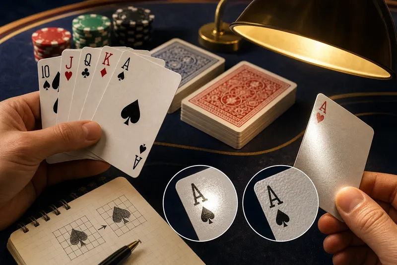
A diamond can disappear in a bright reflection before anyone has time to argue about the hand. Playing card print and finish shape that small optical problem: casino cards must show their symbols clearly while light, viewing angle, and surface texture keep changing.
Why do casino cards depend on visual contrast?
Card identification is a simple visual classification task. A player looks for a rank and a suit, then distinguishes that pattern from the surrounding face design. Strong contrast makes the separation easier; decorative detail near a corner index adds visual noise.
Corner indices let a player expose only a narrow strip of a card while keeping its identity visible. In a fan of cards, the marks form a compact information system: position and shape help the eye locate the index, while color and symbol identify the suit.
This is a useful connection to mathematical models of perception. A toy model could represent a card corner as a grid of light and dark cells, then ask whether a symbol remains distinguishable when a patch of glare obscures part of the grid. The model would not reproduce every human response, but it makes the design tradeoff plain: a symbol with clear edges and space around it is less vulnerable to nearby clutter.
How do printed layers affect what the eye sees?
A playing card usually combines a paper-based core, printed faces, and a surface treatment. The core gives the card structure; the printed face carries the ranks, suits, and artwork; the finish changes how light reflects and how the card feels in the hand.
Some designs use an opaque center layer to limit show-through from the opposite face. That matters in casino play because marks visible through a card can confuse identification and compromise the clean separation between front and back. Printing quality also matters: fine lines can blur if ink spreads, while a busy background can make a small suit symbol harder to isolate.
Think of the card layers as a clear folder over a printed sheet. The folder protects the page, but its reflections can also cover a word at the wrong angle. The analogy is imperfect, but it separates two jobs that surface treatments must balance: protect the print and avoid obscuring it.
Does a glossy finish help or hurt card reading?
A glossy surface can make colors look crisp, yet a lamp reflected toward a player may wash out a corner symbol. A matte or lightly textured surface tends to scatter reflections, though the colors may look less vivid. Neither finish wins in every room.
Casino tables add a practical constraint: players sit at different angles under a mix of overhead and nearby light. A finish that reads cleanly from one seat may reflect into another. This is why surface finish should be considered alongside index size, symbol contrast, table lighting, and the direction from which cards are viewed.
Imagine a card room replacing a bright overhead lamp with shaded fixtures, while keeping the same deck. The expected observable result is that fewer reflections land directly on the corner indices, though a player seated at a different angle may still see glare. The change addresses the light path rather than pretending the coating alone can solve every visibility problem.
What can casino card materials tell us about handling?
Repeated shuffling and dealing leave traces. Skin oils can dull a surface, dust can collect on it, and edges can become rough or pale. A crease or scuff may interrupt a printed mark. In casino operations, those changes matter not only for readability but also for the consistency of cards in play.
Wear is a physical change, not a new feature of the design. If a card is visibly bent or marked, it should be removed from play according to the venue’s procedures rather than treated as a puzzle for the table. Storage in its box and protection from spills and grit help limit avoidable damage. Cleaning instructions depend on the card’s material and maker; household solvents can harm a coating.
How can you assess playing card print and finish at a table?
Check the deck under the lighting and from the seats where it will be used. Each observation should lead to a practical decision, not a claim that one finish suits every casino or home game.
- Observe whether a lamp reflection covers a corner index; if it does, change the light position or viewing angle, but if it does not, keep the existing setup.
- Observe whether rank and suit marks separate clearly from nearby artwork; if they blend in, choose a less crowded design, but if they remain distinct, the artwork is not an immediate obstacle.
- Observe whether red and black suit marks are distinguishable by both shape and color; if color alone carries the distinction, prefer a design with clearer suit shapes, but if shape also helps, retain the design for further checks.
- Observe whether the face shows through from the reverse; if it does, choose a deck with stronger opacity, but if it does not, show-through is not a reason to reject it.
- Observe whether scuffs, creases, or rough edges interrupt a symbol; if they do, set the affected card aside, but if the marks remain intact, continue checking the rest of the deck.
- Observe whether the smallest indices are comfortable for everyone who needs to read them; if they are not, choose larger, more clearly spaced indices, but if they are, no change is needed on size alone.
Say a casino training room has two candidate decks and a pendant lamp above the table. The first has thin corner marks on a reflective face; the second has broader indices on a quieter background. A staff member places both under the same lamp, checks them from each seat, and finds that the first deck’s index catches a reflection from one side while the second stays legible. The resulting choice favors the second deck for that room, while leaving open the possibility that different lighting could change the comparison.
Which playing card print and finish questions do readers ask?
Why are rank and suit marks printed in the corners?
Corner indices let players identify a card while showing only part of its face. Marks at opposite corners also make the card readable when it is turned around.
Can a glossy finish make a casino card harder to read?
Yes, if a light source reflects toward the reader and washes out a symbol. Adjusting the light or viewing angle may help, but contrast and index design matter too.
Does a textured finish mean the print will resist wear?
No. Texture describes surface feel and how light is scattered; it does not establish how well a particular print resists wear. The stock, coating, ink, and handling all contribute.
Are larger indices always easier to read?
Larger marks can be easier to notice, but size cannot compensate for poor contrast or crowded decoration. Clear spacing and recognizable suit shapes matter as well.
Playing card print and finish are useful examples of materials science meeting casino design: the surface changes how light reaches the eye, while the printed pattern organizes information for quick recognition. When comparing cards, look at the whole optical path—from lamp to coating to symbol to reader—rather than treating a finish label as the answer.